OnePlus’ smartwatch dreams have been brewing for years. In 2016, former CEO Carl Pei tweeted sketches of a wearable the company had been working on for at least a year, but that device never came to be. Five years later, the world of wearables is a lot different. Devices from Apple, Samsung and Fitbit have matured and found their identities, while Wear OS appears to be in chrysalis.
This is the industry OnePlus is entering, and it clearly needs a way to stand out. Instead of relying on Google’s Wear OS for its smartwatch debut, the company has come up with its own software. That’s not the only differentiator: The company’s phones are known for their rapid charging tech and it’s cleverly brought that to the OnePlus Watch. Modern smartwatches take freakin’ ages to charge, but OnePlus is promising a week’s worth of juice in just 20 minutes. And its $159 price tag is another pro. But with a brand new OS and little else unique, the OnePlus Watch struggles to hold its own against the competition.
Pros
- Fast recharge speed
- Long-lasting battery
- Crisp display
Cons
- One size only
- Unintuitive app design
- Outdated features
Gallery: OnePlus Watch review photos | 10 Photos
Gallery: OnePlus Watch review photos | 10 Photos
Design and hardware
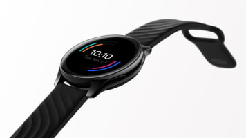
First, the design. OnePlus starts off on the wrong foot here, and not purely because the Watch is too large for my wrist. The bigger issue is that there’s only one size available. I understand OnePlus might not have the production capability to offer different versions, but this isn’t a very inclusive approach. At 46mm, the OnePlus Watch’s case basically covers my entire wrist and will probably be too big for most people with slender arms. At least the case isn’t too thick. It’s about the same height as the Galaxy Watch Active 2 and the Apple Watch SE.
My review unit also came with a strap that, at its tightest, was still too loose for me. This meant that I had to keep pushing the watch up my forearm while I was working out or I wouldn’t get accurate heart rate readings. I also wish the strap used a buckle closure instead of the unwieldy peg-and-hole method that makes it hard to put on. Those complaints aside, the OnePlus Watch is a clean-looking device. I’m not super impressed with its basic design, but others have commented on how nice they think it looks.
That might have something to do with the OnePlus Watch’s 1.39-inch AMOLED screen, which is eye-catchingly roomy and easy to read. I have no issue with the display itself, but I’m bummed that there doesn’t appear to be an Always On mode. That, combined with the fact that the maximum screen timeout option is just 8 seconds, means I was often left looking at a black circle.
Setup and health tracking
Before we get too far, it’s important to point out that the OnePlus Watch currently only supports Android devices. You’ll need to install the OnePlus Health app from the Play Store to manage your watch and sync data. This app looks nice, aesthetically, but feels unrefined. Things aren’t where you expect them to be. There are three buttons at the bottom for Health, Fitness and Manage, and most of your watch’s settings can be found in that last panel. But there’s also a little icon on the top right of the screen that looks kinda like a gear wheel, and some settings, like your preferred units of measurement, have to be set there instead.

Cherlynn Low / Engadget
If you want to look at your logged workouts, you can see them under Health. But the organization is kinda weird. This page shows your progress on things like sleep, heart rate, blood oxygen and stress for the day, with a card for “workout logs” at the end. This brings you to all the workouts ever recorded on the app, with the total number of minutes, sessions and calories burned at the top.
You can sort this by types of exercise like running, cycling or yoga. Below is a reverse chronological list of your sessions so far, and you can tap each one for more details. If you want to see your active time or workout progress for the week, you’ll have to go back to the Health page and tap the daily report card at the top, but you can’t see details for individual workouts that way. It’s just really clunky navigation all around.
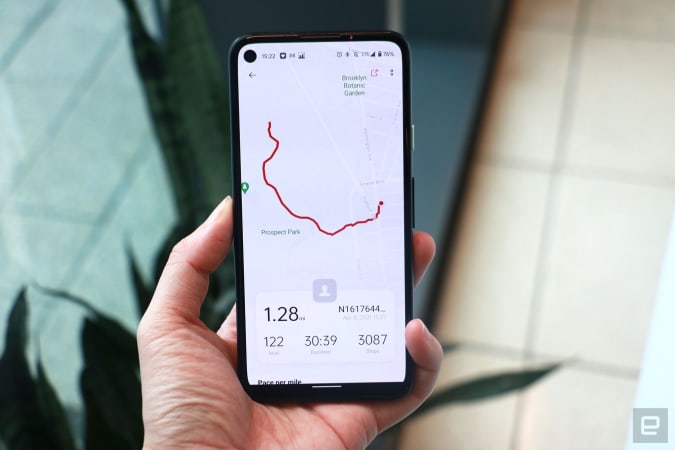
Also, the “Fitness” section just shows you your logged runs and walks — nothing else. Most of the screen here is devoted to a placeholder for a map, complete with a Google Maps logo at the bottom and a dot that seems to indicate where you are. But in my days of testing I’ve never seen an actual map show up. Only after I tapped into each individual logged walk did I eventually see my route. OnePlus said a fix is coming to resolve this, though I’ve yet to receive it. Also, the Watch didn’t track my path accurately, missing a detour I made around an entire block. In contrast, the Apple Watch SE and Galaxy Watch Active 2 mapped my journey correctly.
Cherlynn Low / Engadget
I like that OnePlus tries to differentiate itself from all the ring-based progress-tracking graphics that Apple and Google use, but its approach is slightly confusing. Your daily activity is still shown in circles, but each metric, like Steps, Activity, Workout and Calories, are represented by quadrants. The more sleep you get, the more you’ll fill up the blue quadrant, for example. It’s not as easy to understand at a glance.
Then there’s workout tracking, which is one of the biggest reasons people get a smartwatch. For the most part, the OnePlus Watch is adept at logging my exercise. I used it for stationary bike rides, treadmill runs, outdoor walks and weights training sessions, and across the board it registered heart rate and calorie burn that was in line with the Apple Watch and the machines themselves. Occasionally, the Watch showed significantly lower heart rates than the other devices, but it picked back up fairly quickly. I also suspect the loose fit of this ginormous Watch had something to do with it.
Those who want accurate run tracking might be more concerned by the fact that the Watch undercounts distance, or steps taken. On one of my treadmill runs, it lagged the machine by a third of a mile, which messed up my pace. I encounter this issue with the Apple Watch SE all the time, though, so I am willing to be more forgiving here. On one outdoor walk the OnePlus Watch said I only covered 1.38 miles while Apple and Samsung’s devices reported 1.58 and 1.7 miles respectively. (By a rough calculation from Google Maps, the actual distance was closer to 1.55 miles.)
I’m more annoyed by how sensitive the OnePlus Watch is at pausing my workouts, stopping whenever my pace slowed for a teeny tiny bit. Though, it did resume quickly enough when I’d speed back up.
Cherlynn Low / Engadget
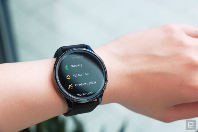
You can also take the Watch in the pool for your swim workouts, since it’s rated for IP68 and 5ATM of water resistance. I don’t have access to a pool so I can’t vouch for swim tracking. There are other workouts you can track, too — up to 100+ workouts, according to OnePlus, but the fine print on its website clarifies that “110+ workouts types will be available after first OTA update” and that these include customized workouts created by the user. Also, only 15 workout types have algorithm support. That’s a reasonable number, though some of them are confusing. When I wanted to log my indoor run, for example, I didn’t know if I should choose “Fat Burn Run” or simply “Running” — there was no option designed for treadmills.
Basically, the Watch is fine as a fitness tracker, but it’s a victim of rough execution. The same goes for its sleep tracking. I wore the hulk of a watch to bed, and was horrified when I opened the Health app the next morning to find no sleep logged whatsoever. It was only when I looked at the Watch itself and saw 6 hours and 21 minutes recorded that I sighed in relief knowing that the device had actually tracked my sleep. It just didn’t send that info to the app. That wasn’t just a slow syncing issue, either. Days later, that sleep data still hasn’t shown up on my phone. OnePlus said it is aware of this problem and will release an update that should fix it later this month.
My other issues with the OnePlus Watch feel like problems other fitness trackers solved years ago. The heart rate monitor is slow to deliver a reading, compared to the Apple Watch SE. Trying to get a blood oxygen reading manually also requires you to hold your wrist up and remain still for 10 seconds.
Cherlynn Low / Engadget
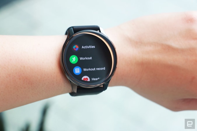
It’s not just the sluggishness that makes the OnePlus Watch feel like a device from 2018 — it’s the company’s OS, too. It’s very similar to Wear OS. You can swipe up from the home screen to see your notifications, pull down to find your quick settings and swipe left to see widgets. Pressing the top side button brings up your apps, while the other physical key is programmable for your preferred shortcuts.
Unlike WearOS, though, there’s no page to the left of the home screen. Google uses that for the Assistant, while on the OnePlus, swiping right on the home screen does nothing. To be fair, though, Samsung’s Tizen OS does nothing when you swipe up either.
OnePlus does offer several features you’d expect from most modern smartwatches, like music playback controls, breathing exercises, weather reports and a few third-party apps. It’ll also let you control your OnePlus TV. But in some ways the Watch is incredibly backward. For example, when you get a message from supported apps like Telegram or WhatsApp, you can choose from one of four preset templates to reply. Just four! You can tell your friend “OK,” “Be right there!” “In a meeting, contact you later” or “I’m driving, contact you later.” Even Fitbit gives you more options than that robotic quartet. And there’s no way to dictate or customize your own presets.
One last example of how unfinished this OS feels: sometimes you’ll be bombarded by repeated notifications on your wrist for one thing that actually happened on your phone. This is a minor bug, but a truly annoying one.
Cherlynn Low / Engadget
Battery life and charging speed
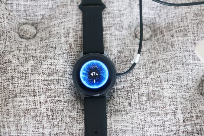
OnePlus’ single saving grace here is battery. After four days of pretty heavy use including GPS and workout tracking, my OnePlus Watch still shows 23 percent of juice left, which is on par with some Fitbit and Garmin devices. It’s respectable, but not surprising given the lack of an always-on display and a short screen timeout. More impressive is the recharge time. Within five to ten minutes of plugging the watch in, it got back up to about 43 percent. If you’re not using it to track your outdoor runs all the time, that is likely to last a couple of days at least.
Wrap-up
That’s an impressive technological achievement, but it gets me to the question at the heart of this review. What’s the point of super fast charging and long-lasting battery if the Watch itself is completely underwhelming? For $159, the OnePlus Watch is certainly affordable, but it would have felt half-baked even in 2018. If you’re after a cheap watch for your Android phone that can reliably track your fitness and last about a week, consider a lower-cost Fitbit like the Charge 4 instead. Even the older Versa would serve you well. Until OnePlus seriously improves its software, its debut smartwatch can’t compare to what’s out there.
"Review" - Google News
April 13, 2021 at 06:02PM
https://ift.tt/32cfuHC
OnePlus Watch review: Just get a Fitbit instead - Engadget
"Review" - Google News
https://ift.tt/2YqLwiz
https://ift.tt/3c9nRHD
Bagikan Berita Ini


0 Response to "OnePlus Watch review: Just get a Fitbit instead - Engadget"
Post a Comment