
Much has been written about people embracing nostalgia for comfort during the COVID-19 pandemic. With the new 24-inch iMac's bright colors and simplistic design, Apple seems to be indulging in the pangs of nostalgia, too.
But the new iMac's nostalgia is only skin deep. Inside, it has arguably the most advanced CPU currently sold in consumer devices: the M1. This chip is equally at home in an iPad and a Mac, yet the M1 delivers performance that rivals or beats some of the best desktop chips available in some cases.Even though the M1 offers enough performance to attract power users, this new iMac isn't really for them. Rather, the 24-inch iMac is first and foremost about simplicity. It's a computer that promises users they won't have to think about how to configure or maintain a system. It's a computer that's more concerned about fitting into the room than it is about taking you somewhere else.
It's a computer that Apple could easily promote with the exact same ad that it ran back in 1998 for its inspiration, the iMac G3. "Presenting three easy steps to the Internet," said Jeff Goldblum, the commercial's narrator. "Step one: plug in. Step two: get connected. Step three... there is no step three." Say hello to iMac.
Table of Contents
Specs
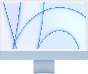
Apple iMac (24-inch, 2021)
As with those Macs, the M1's CPU has four high-performance cores and four efficiency cores. The cheapest 24-inch iMac configuration ($1,299) has seven GPU cores, while the others have eight. Further, the cheapest model has a different cooling system, with just a single fan to the other configs' two.
At purchase, the computer can be configured with either 8GB or 16GB of unified memory and either 256GB, 512GB, or 1TB of solid-state storage. Ethernet is also an optional upgrade at an extra $30 for the base config (it's included automatically in the pricier configs), but that Ethernet port is in the power brick, not the Mac itself.
| Specs at a glance: 2021 24-inch iMac | |
|---|---|
| OS | macOS Big Sur 11.4 |
| CPU | Apple M1 |
| RAM | 16GB |
| GPU | Apple M1 |
| HDD | 512GB SSD |
| Networking | Wi-Fi 6; Bluetooth 5.0 |
| Ports | 2x Thunderbolt, 2x USB-C, 3.5mm headphone, MagSafe, gigabit Ethernet (on the power brick) |
| Warranty | 1 year, or 3 years with AppleCare+ |
| Price as reviewed | $1,899 |
Other ports besides Ethernet include a 3.5 mm headphone jack, two USB-3 (USB-C) ports, and two Thunderbolt/USB-C ports that support DisplayPort and USB 4 (up to 40Gb/s), as well as USB 3.1 Gen 2 (up to 10Gb/s). You'll need to buy some adapters for HDMI or anything else not listed here.
This is the first Mac in a long time with a MagSafe magnetic power adapter port. The port is a very different design than in previous Macs with MagSafe, but it's more or less what you'd expect, albeit a fair bit more resistant to popping out than the old MagSafe. Also returning from past iMacs is Touch ID, which until now has only been available with Apple's laptops. The iMac's keyboard comes with it, and Apple says it will work with other M1 Macs like the Mac mini if you pair the keyboard with those devices.
 There are two Thunderbolt and two USB ports on the back.Samuel Axon
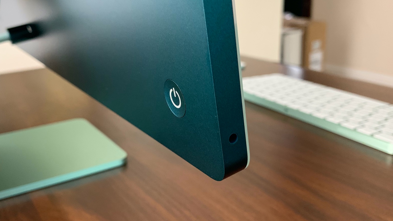 You'll find the headphone jack on the side.Samuel Axon
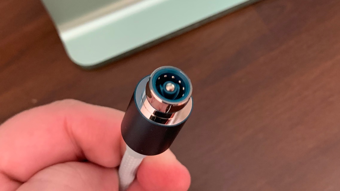 Here's the new MagSafe cable.Samuel Axon
 And you'll find Ethernet on the power brick, provided you purchased a configuration that includes it.Samuel Axon
 The camera has gone from 720p to 1080p, thankfully.Samuel Axon
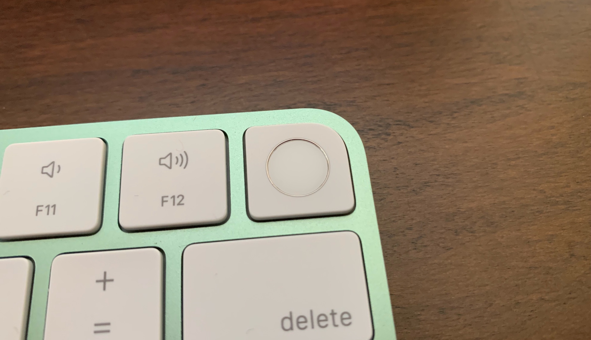 You now get Touch ID in the keyboard that comes with the iMac.Samuel Axon
The display is quite glossy, albeit not as aggressively so as some previous iMacs, and Apple doesn't offer a matte or nanotexture configuration option.
Above the screen is a 1080p FaceTime HD camera. That's a big upgrade over the 720p camera in the 21.5-inch iMac but sort of on par with the most recent 27-inch iMac. I say "sort of," because this camera performs much better than the 1080p camera in the 27-inch iMac due to the M1's ISP.
The ISP enables computational photography and video capabilities like tone-mapping and noise reduction. In ideal shooting conditions, the difference compared to a non-M1 equivalent is modest, but we found that the ISP makes an enormous difference in suboptimal conditions, like low-light situations or when the user has a bright light behind them.
Three microphones will capture the audio on your video calls, and the new iMac has a six-speaker system that includes two pairs of woofers, each accompanied by a tweeter. Apply says these speakers do spatial audio via Dolby Atmos, though I maintain the advantages of Dolby Atmos are minimal in a stereo setup.
Wireless specs include Wi-Fi 6 and Bluetooth 5.0―pretty much what you expect from a computer these days.
Design
Never before have I seen a personal computing device that is so simultaneously futuristic and rooted in nostalgia.
Let's start with the futuristic part: the new iMac is just 11.5 mm (0.45 inches) thick. That means this 24-inch iMac has 50 percent reduced volume and a 30 percent smaller footprint than the 21.5-inch iMac it follows. It also has 50 percent smaller bezels above and to the sides of the screen.
It's so thin, in fact, that the headphone jack has to be on the side to fit the plug in, and the Ethernet port likewise has to live in the power brick. That last bit is a clever solution for the fact that many users have wanted Ethernet ports, but Apple's laptops (and now desktops) have gotten so thin they wouldn't fit. I wouldn't be surprised to see Apple offer the same option with future MacBooks.
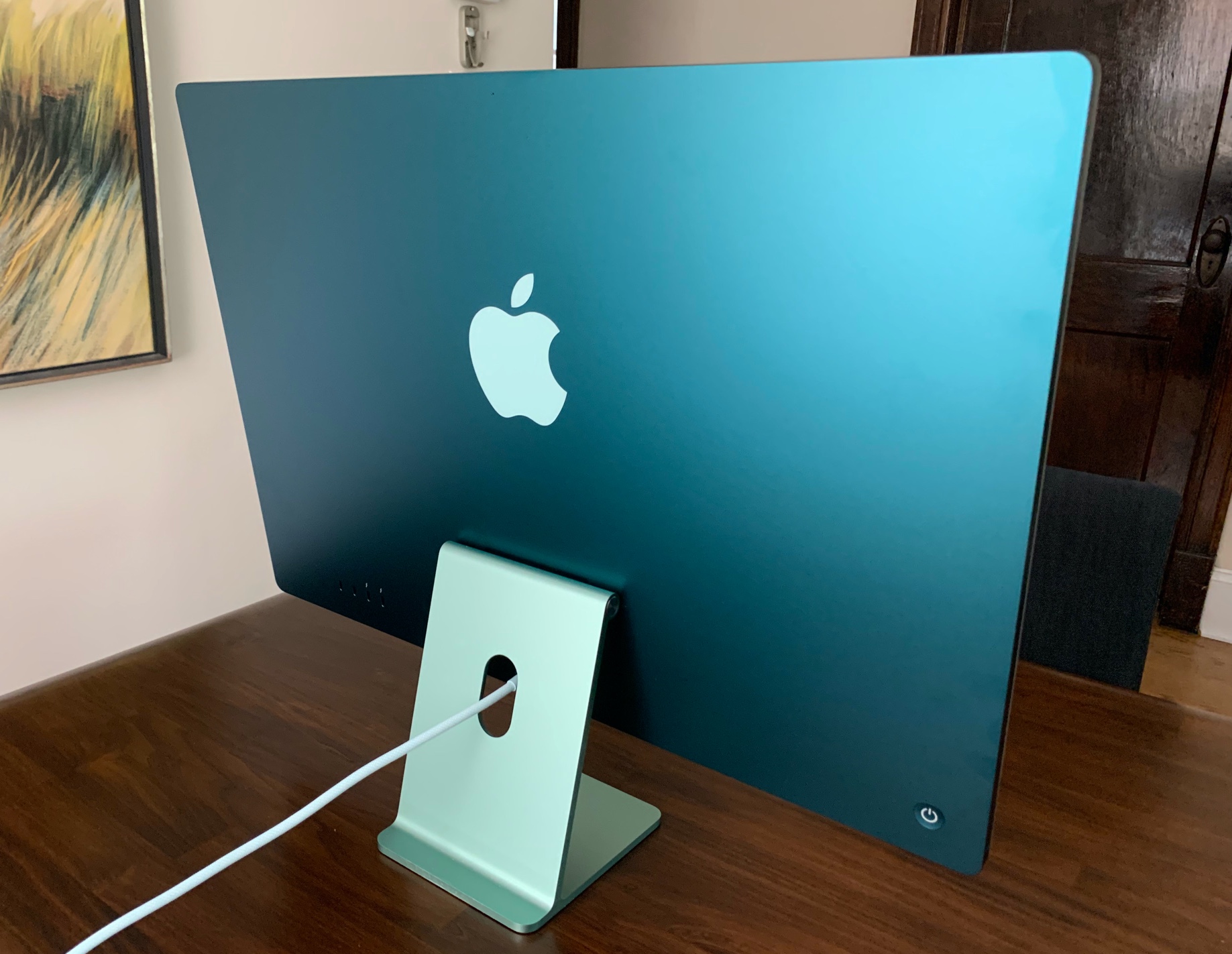 The back of the 24-inch iMac.Samuel Axon
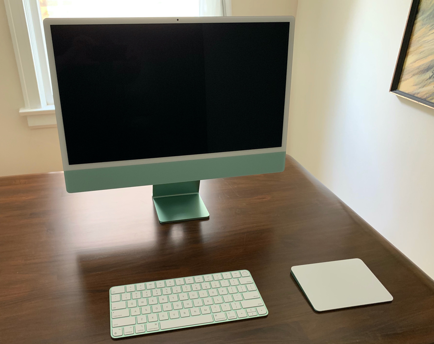 And here's the front.Samuel Axon
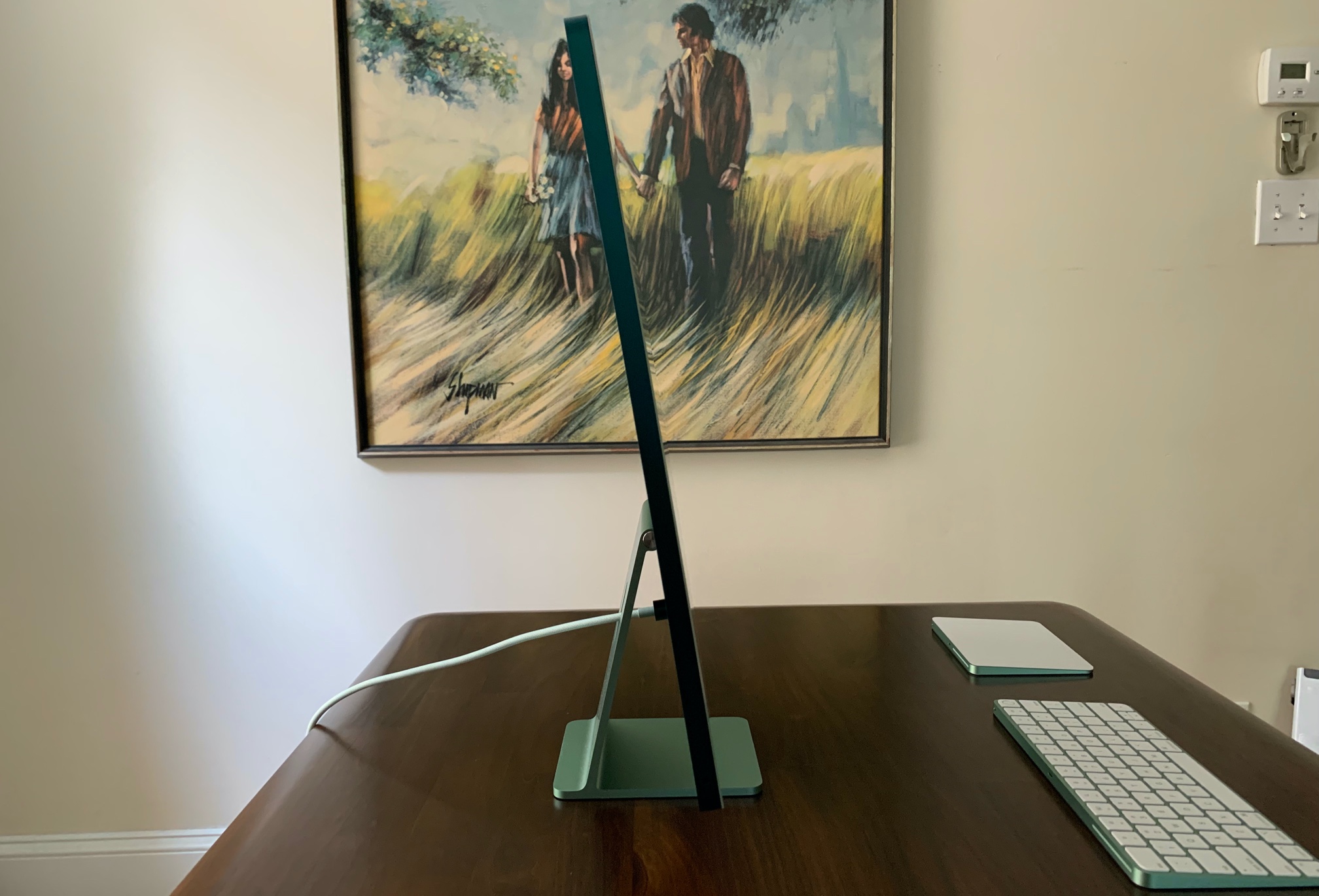 That is one thin desktop computer.Samuel Axon
 The hinge is easier to work with than what we got in the 21.5-inch iMac.Samuel Axon
As we learned from an X-ray and teardown over at iFixit, almost all of the silicon is in the device's chin, below the display. (There's also a small display board in the form of a strip along the inside of the top of the chassis, above the display.)
That at least explains the chin. Apple clearly decided to keep that chin in lieu of thickening the machine, either because the iMac's design team felt that thickening the chassis would take away from its blending-in-with-the-room vibe, because the chin is part of what makes a modern iMac recognizable as an iMac, because this approach netted what seemed like the best thermal management solution, or because of some combination of any of those things.In any case, the Apple logo we're used to seeing in that chin is not present; it's just blank space, which to me just accentuates how much, well, blank space there is. I don't dislike it, but it is a bit strange after the iMac has looked a certain way for so many years.
The thinness has some advantages besides aesthetics and space. The device is easier to transport between rooms, and the screen hinge is in a more manageable place because it doesn't have to support as much weight. Unfortunately, adjusting the iMac's height is still not possible.
Compute the rainbow
The iMac comes in seven colors, in a throwback to the iMac G3's kaleidoscope:
- Blue
- Green
- Pink
- Silver
- Yellow
- Orange
- Purple
Each comes in a two-tone design, with a lighter shade on the single glass sheet that makes up the front and a darker one on the back. Owners of the new iMac can pick the color they want to match their space or, conversely, to make the computer stand out. And if you're not a fan of the colors, silver is probably your best bet.
Whatever color you buy, you'll get a matching keyboard and mouse or trackpad, plus matching cables. You'll also find that the UI colors have been themed to match the color you picked. (You can, of course, change all the relevant UI colors whenever you want, as you can on any Mac.)
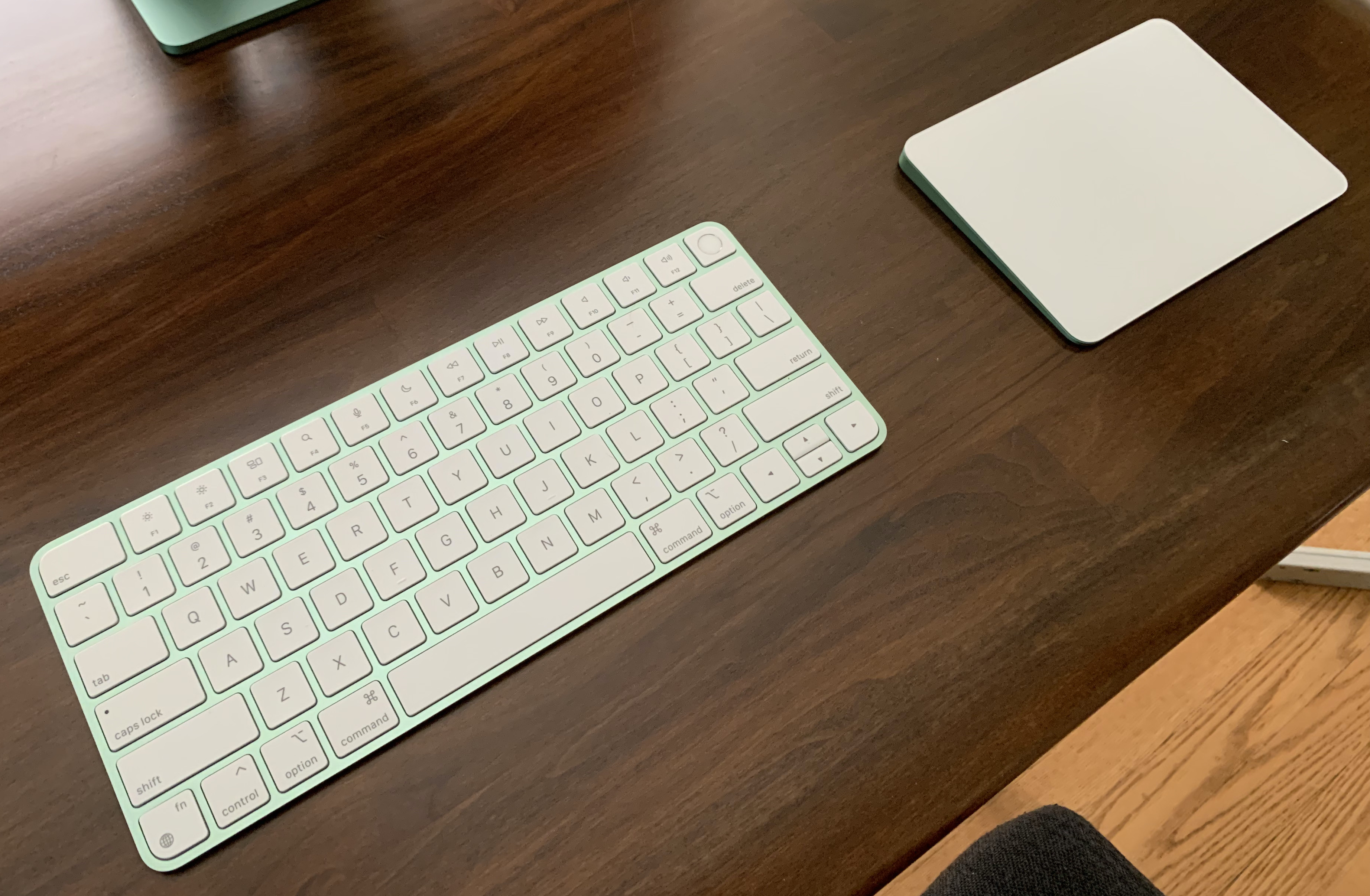 It's subtle, but this Magic Keyboard and Magic Trackpad combo matches the green iMac.Samuel Axon
 You might not notice the Magic Mouse matches, too, until you look at the bottom of it.Samuel Axon
 Even the included USB-C cable is green.Samuel Axon
The iMac will even come with a screensaver that writes the word "hello" over a colored background, in a callback to the "hello" seen on the Macs of yore. Is there such a thing as Apple fan service? Because this iMac seems to be all-in on that whole fan service thing with nods both subtle and unsubtle to Mac geekery and pop culture from the past.
About those white bezels
Unfortunately, Apple has found yet again that you can't please everybody. Whatever people may think of the colors, a lot of users are not fans of the bezel around the screen being white.
Certain users prefer computers with black bezels that put the focus on the screen. To them, black bezels don't draw the eye away from the task or content they're consuming or engaging with.
White bezels, these users argue, are distracting. They pull you out of the digital world you're trying to navigate. These folks are not wrong, but I nonetheless believe this is by design.
Look, different people want to have different kinds of relationships with technology. For the proudly geekiest among us, immersion in the digital world might be paramount. We might want to achieve the flow state when we're programming or editing a photo, or we want to get lost in the fantastical world of a TV series or a video game.
Others among us, though, are not looking for immersion. They are looking for devices that fit naturally in a real space, and they want to be continually aware of where they are in that space. They don't want to be immersed in the digital world; they want devices to play a subordinate role to the real world in their consciousness, always.

I read the choice to surround the screen with bright bezels as Apple taking a position on which group of people this machine is for. Consider the iMac as a kitchen computer, on which YouTube videos guide a home cook through the recipe as he prepares dinner for his kids. Alternatively, think about the receptionist at the front desk of a hair salon, booking future appointments for walk-ins on a busy day. Or picture it in a classroom, where students need to use software while paying close attention to an instructor and their classmates.
In all these cases, digital space plays a secondary role to the larger context, and achieving a sort of digital flow state is actually undesirable.
To illustrate this point another way, here's a brief anecdote. About a decade ago, I worked at a burgeoning tech startup. About half of the 80 or so employees at the time were engineers, and the other half were sales, customer support, and marketing folks. They were constantly fighting.
What about? Well, there were huge bay windows all around the open office. The engineers wanted them perpetually curtained off, shrouding the office in a focus-inducing eternal darkness as they scrolled through their JavaScript and Objective-C while wearing over-ear headphones. The non-engineers found this unlivable and craved sunlight as they socialized and chatted with each other about clients and work trips.
People passive-aggressively covered or uncovered the windows and sent angry emails to the entire company daily. Otherwise kind and gentle co-workers actually got into fights about this, unable to fathom the other side's priorities or mentalities. The CEO had to take meetings about the issue.
The hostilities went on for months until the company rented a second floor in the building. There, engineers could work separately, close off all the windows, and code in the glow of their computer screens beneath a giant banner on the wall depicting Steve Ballmer chanting "developers, developers, developers."
The 24-inch iMac is for the non-engineer employees at that company.
Personally, I live and die by the digital. When I use my computer, I can lose consciousness of anything outside the viewport. I want it that way. But not everyone feels the same, and the new iMac seems to be for those other folks. Good on them. I'm just hoping that the inevitable Apple Silicon replacement for the 27-inch iMac will be offered with some darker bezels as an option.
So, I get the geek rage on Twitter about this iMac design. I just think that, as is so often the case when Apple elicits geek rage online, it's because this particular product wasn't really made for the geeks. That's OK, as long as the geeks invested in the ecosystem ultimately get something tailored to their needs.
Anyway, are you looking for a computer that will be an accent piece in your space but not your main focus or the main focus of said space? If so, the 24-inch iMac has you covered.
Performance
Before we dive into benchmark results, here are the basic specifications of the machines we're testing here:
| Model | CPU | GPU |
|---|---|---|
| 24-inch iMac (M1) | Apple M1 | Apple M1 |
| Mac mini (M1) | Apple M1 | Apple M1 |
| MacBook Air (M1) | Apple M1 | Apple M1 |
| Mac mini (Intel) | 3GHz 6-core Intel Core i5 | Intel UHD Graphics 630 |
| 2020 27-inch iMac (Intel) |
3.6GHz 10-core Intel Core i9 | AMD Radeon Pro 5700 XT |
| 2020 13-inch MacBook Pro (Intel) | 2GHz 4-core Intel Core i5 | Intel Iris Plus Graphics |
| 2020 MacBook Air (Intel) | 1.1GHz 4-core Intel Core i5 | Intel Iris Plus Graphics |
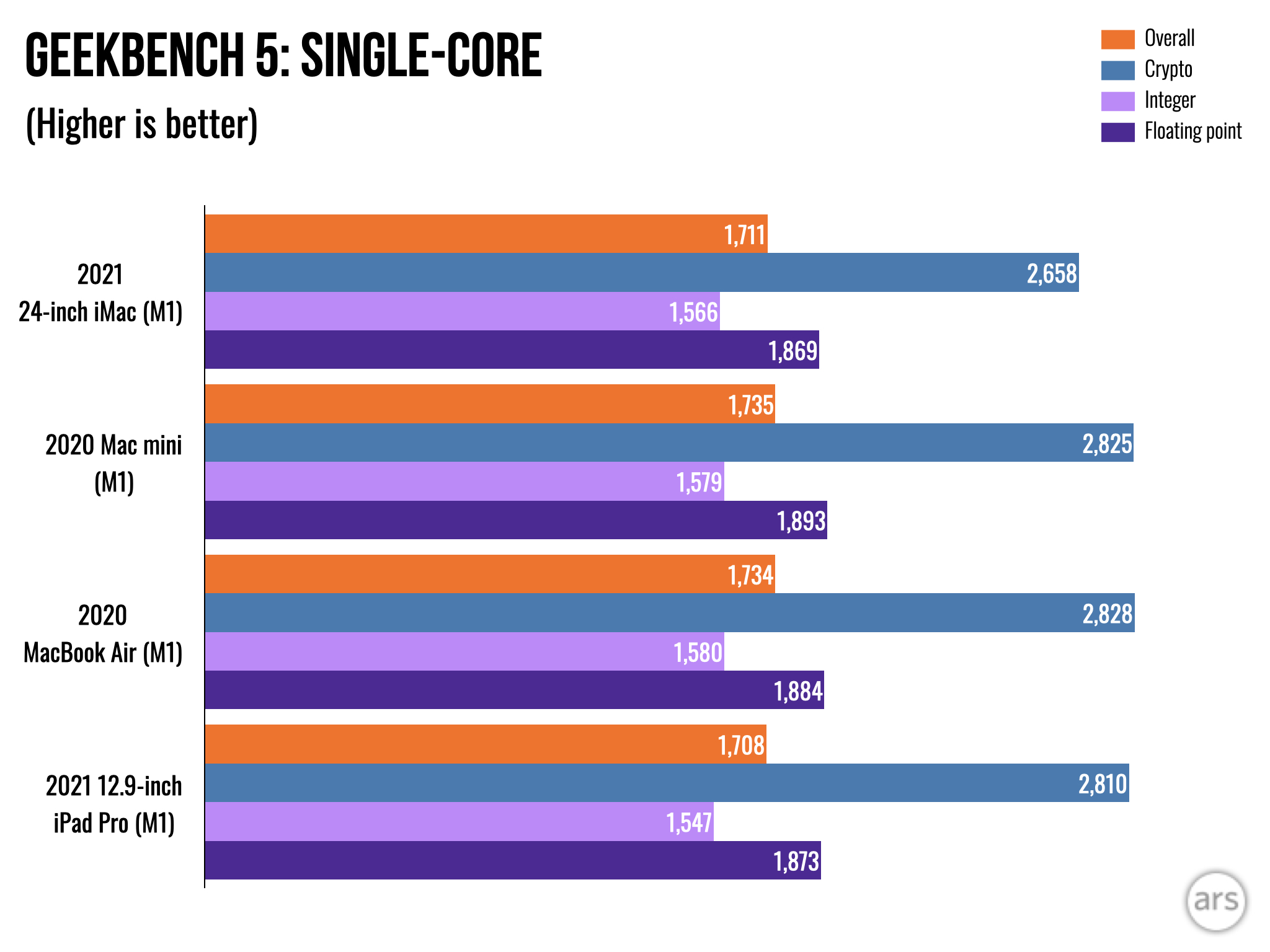
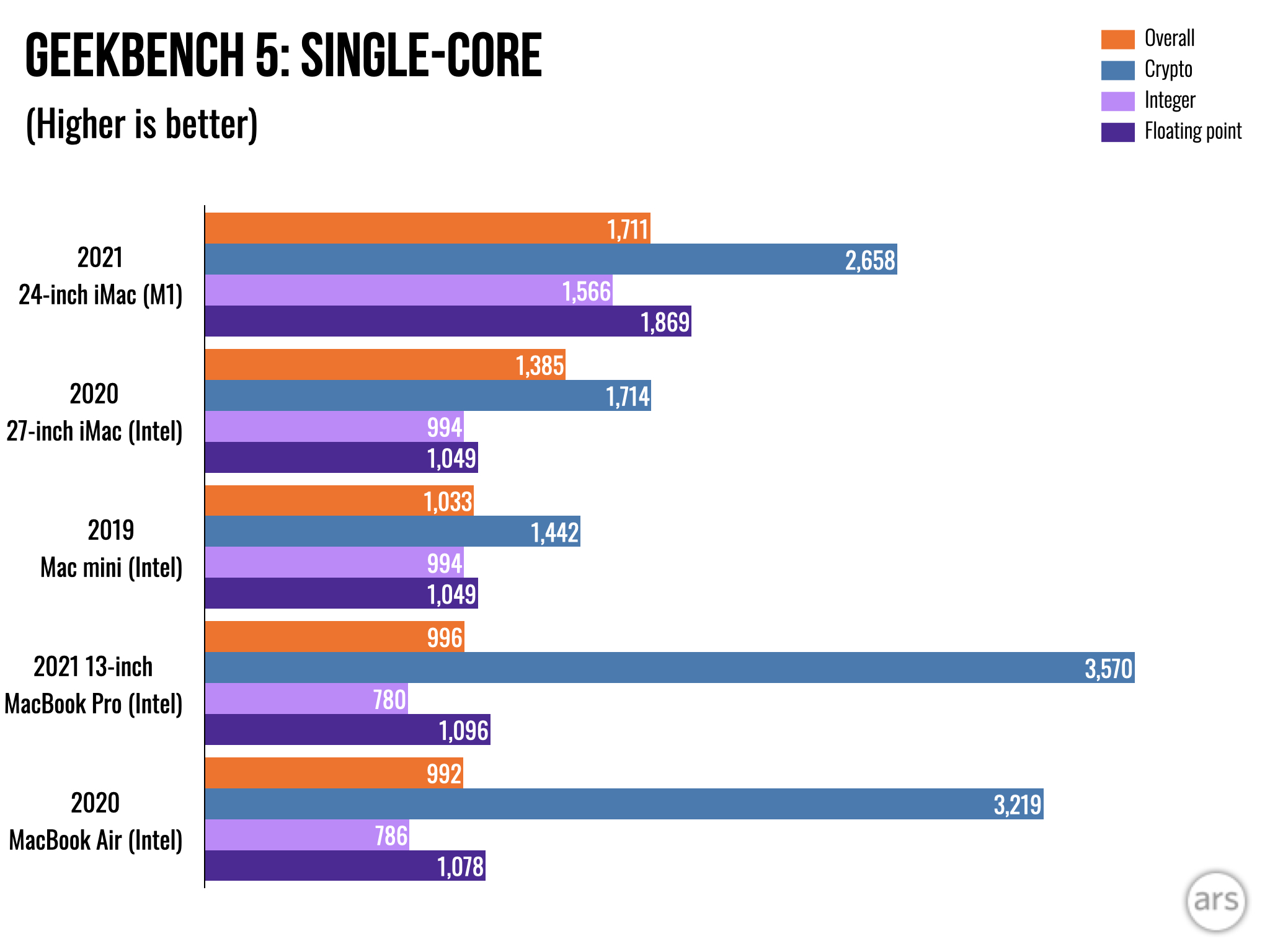
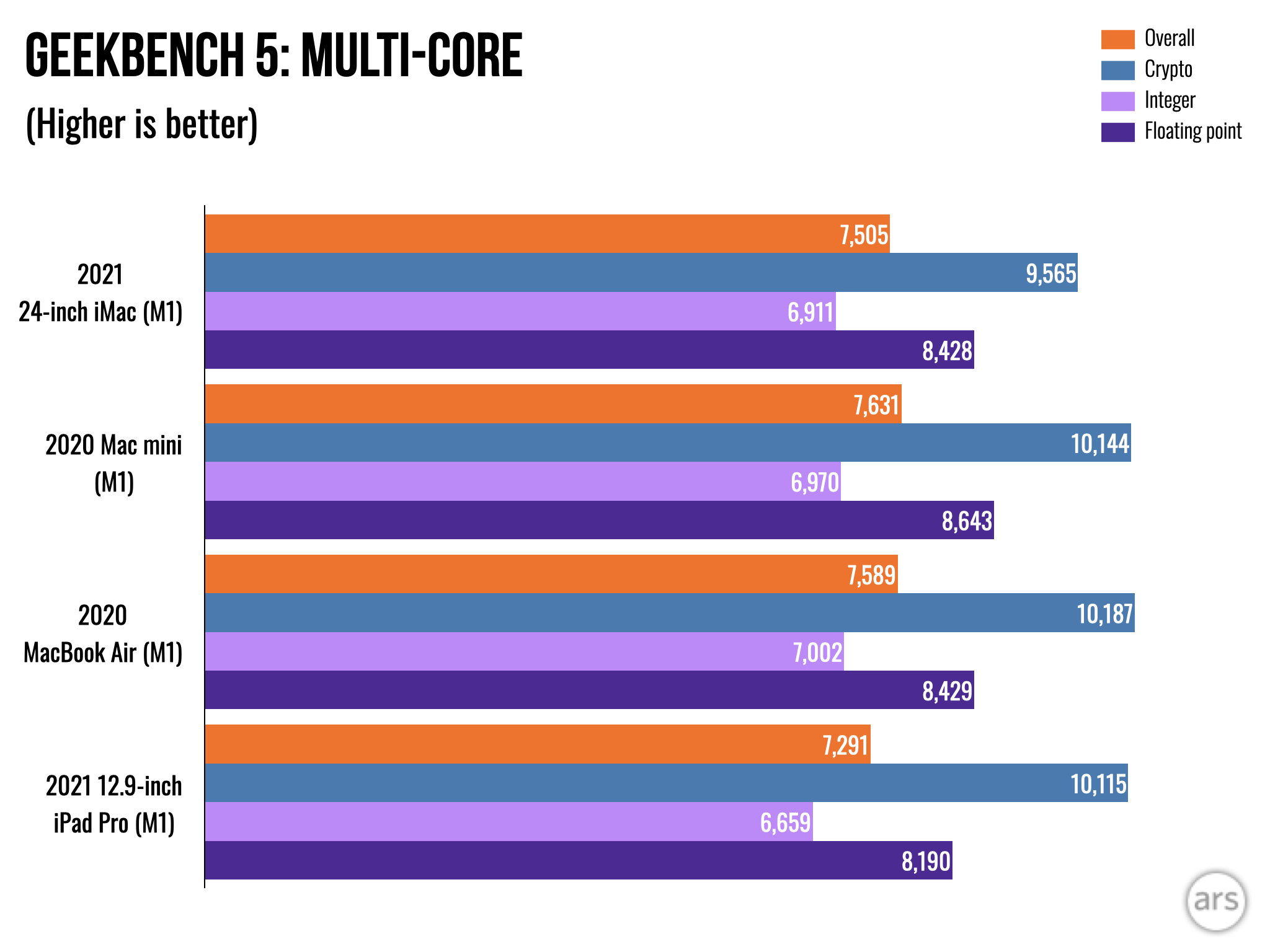
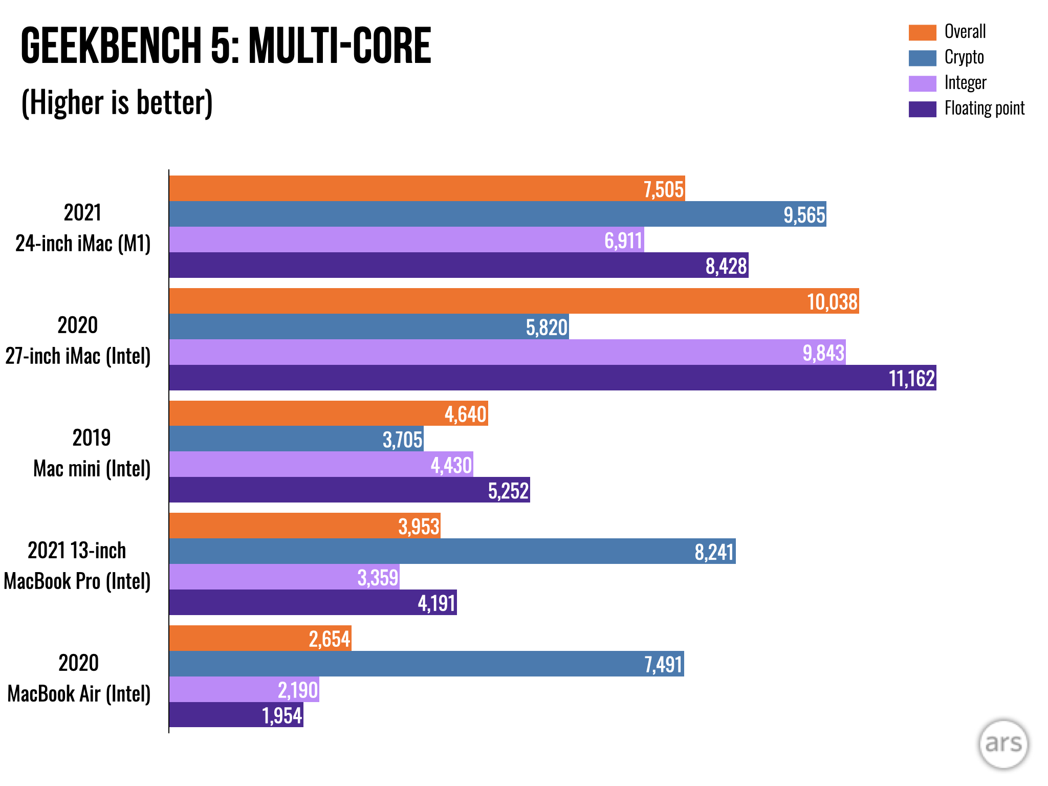
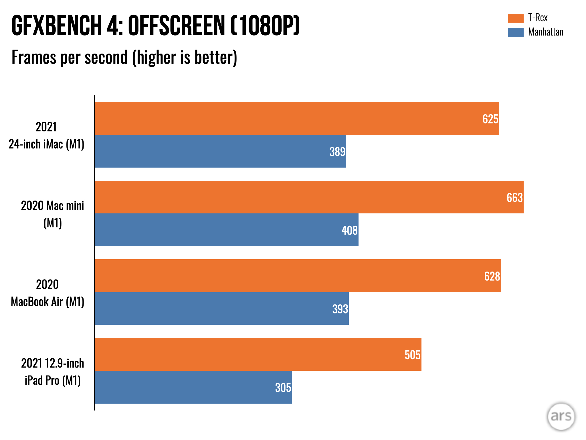
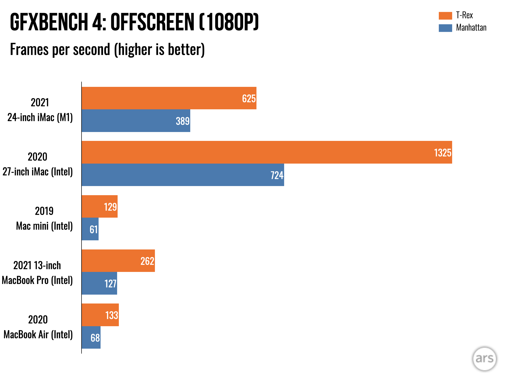
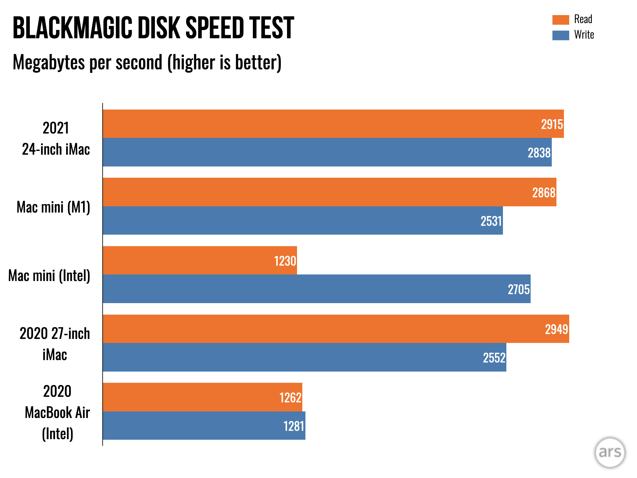
You might expect us to focus on the performance, given that this is Ars Technica. But the truth is that there's not much of a performance story here, because it has an M1, and we've reviewed M1-equipped devices four times now. Every time, the M1 has delivered almost exactly the same performance. This time is no exception.
We've written plenty about the M1 already, and if you want to dive deeper on it, check out our Mac mini or MacBook Air reviews from late last year.
The MacBook Air desktop
The 24-inch iMac is laced with nostalgia and fan service for Apple die-hards. All that's missing is a new ad campaign starring the voice of Jeff Goldblum.
At its core, it's a desktop MacBook Air with a bigger, more beautiful screen. People love the MacBook Air (for good reason), so that's entirely welcome.
The iMac focuses on keeping things as simple as possible. When you buy one, you're paying a premium for that simplicity―fewer moving parts, fewer configuration choices, fewer choices in general. You plug it in and turn it on. That's it. There's no step three, as the ad says.
That's going to appeal to a lot of people. This iMac is very easy to recommend as a computer for most basic tasks either in a home or at point of sale, provided you want to pay for that gorgeous screen. (And if you have the cash, it's worth it compared to most monitors you might buy to go with a Mac mini.)
On the other hand, we recommend holding out to see what Apple does to replace the higher-end 27-inch model if you're a power user who wants the best that the new wave of Apple Silicon Macs has to offer.
The 24-inch iMac might have one of the most advanced chips in the world inside, but you can be confident that will change soon as Apple begins addressing its higher-end products. For most people, though, that won't matter. The M1 offers more than enough for most folks, and you probably already know whether you're someone who may need a bit more.
Put another way: this is the best desktop Mac for most people, and that's something we don't see changing imminently.
The Good
- Excellent performance for a computer in this class
- Thin, low-footprint design and varied color options allow it to find a natural place in most spaces
- Outstanding display
- Very good audio and video capture for Zoom calls and the like
The Bad
- Port selection means at least a dongle or two (or a dock) for many users
- Stand height is not adjustable
- A bit pricey
The Ugly
- Light colors and design won't suit everyone's tastes
"Review" - Google News
June 06, 2021 at 08:30PM
https://ift.tt/3vXsBd8
24-inch iMac review: There’s still no step three - Ars Technica
"Review" - Google News
https://ift.tt/2YqLwiz
https://ift.tt/3c9nRHD
Bagikan Berita Ini


0 Response to "24-inch iMac review: There’s still no step three - Ars Technica"
Post a Comment